


 上一篇:
上一篇:  下一篇:
下一篇:  文章来自:
文章来自:  引用通告:
引用通告:  Tags:
Tags:  最新日志:
最新日志:
不错呦!smile@林凯西,确保“准备文件”中的几个文件都有安装,S...您好,看了您这篇帖子觉得很有帮助。但是有个问题想请...我的修改过了怎么还被恶意注册呢 @jjjjiiii 用PJ快9年了,主要是A...PJ3啊,貌似很少有人用PJ了,现在不是WP就是z...@332347365,我当时接入时错误码没有-10...楼主,ChkValue值应为-103是什么意思呢?...大哥 你最近能看到我发的信息,请跟我联系,我有个制...
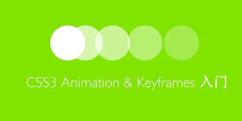
CSS3动画学习笔记
编辑:dnawo 日期:2022-07-17
CSS3动画需@keyframes规则和animation属性一起配合使用才能生效,@keyframes规则定义了一组样式,它设置了多个关键点时元素的样式(也称关键帧),animation属性定义了动画使用的规则、时长、速度等信息。
1、@keyframes规则
@keyframes规则定义了一组样式,它设置了多个关键点时元素的样式,它有两种写法:
复制内容到剪贴板 程序代码
程序代码
程序代码@keyframes styles {
/*0%、50%、100%分别对应动画0%、50%、100%时的状态*/
0% {left: 0px;}
50% {left: 180px;}
100% {left: 200px;}
}
/*0%、50%、100%分别对应动画0%、50%、100%时的状态*/
0% {left: 0px;}
50% {left: 180px;}
100% {left: 200px;}
}
或者:
复制内容到剪贴板 程序代码
程序代码@keyframes styles {
/*from为动画开始时的状态,to为动画结束时的状态*/
from {left: 0px;}
to {left: 200px;}
}
/*from为动画开始时的状态,to为动画结束时的状态*/
from {left: 0px;}
to {left: 200px;}
}
from等同于0%,to等同于100%,显然0%-100%形式可以更加精确的控制动画。为能兼容各种浏览器,推荐写法:
复制内容到剪贴板 程序代码
程序代码@keyframes styles {
0% {left: 0px;}
100% {left: 200px;}
}
@-webkit-keyframes styles {
0% {left: 0px;}
100% {left: 200px;}
}
@-moz-keyframes styles {
0% {left: 0px;}
100% {left: 200px;}
}
0% {left: 0px;}
100% {left: 200px;}
}
@-webkit-keyframes styles {
0% {left: 0px;}
100% {left: 200px;}
}
@-moz-keyframes styles {
0% {left: 0px;}
100% {left: 200px;}
}
2、animation属性
animation属性定义了动画使用的规则、时长、速度等信息,animation的属性有:
 引用内容
引用内容animation-name:指定要绑定到的关键帧的名称;
animation-duration:指定动画需要多少秒或毫秒完成;
animation-timing-function:设置动画将如何完成一个周期;
animation-delay:设置动画在启动前的延迟间隔;
animation-iteration-count:定义动画的播放次数;
animation-direction:指定是否应该轮流反向播放动画;
animation-fill-mode:规定当动画不播放时,要应用到元素的样式;
animation-play-state:指定动画是否正在运行或已暂停;
animation-duration:指定动画需要多少秒或毫秒完成;
animation-timing-function:设置动画将如何完成一个周期;
animation-delay:设置动画在启动前的延迟间隔;
animation-iteration-count:定义动画的播放次数;
animation-direction:指定是否应该轮流反向播放动画;
animation-fill-mode:规定当动画不播放时,要应用到元素的样式;
animation-play-state:指定动画是否正在运行或已暂停;
animation属性写法如下:
复制内容到剪贴板 程序代码
程序代码.todo {
animation-name: styles;
animation-duration: 3s;
animation-timing-function: linear;
animation-fill-mode: forwards;
}
animation-name: styles;
animation-duration: 3s;
animation-timing-function: linear;
animation-fill-mode: forwards;
}
animation属性支持简写:
引用内容animation: name duration timing-function delay iteration-count direction fill-mode play-state;
animation属性简写的写法:
复制内容到剪贴板 程序代码
程序代码.todo {
animation: styles 3s linear forwards;
}
animation: styles 3s linear forwards;
}
同样为能兼容各种浏览器,推荐写法:
复制内容到剪贴板 程序代码
程序代码.todo {
animation: styles 3s linear forwards;
-webkit-animation: styles 3s linear forwards;
-moz-animation: styles 3s linear forwards;
}
animation: styles 3s linear forwards;
-webkit-animation: styles 3s linear forwards;
-moz-animation: styles 3s linear forwards;
}
完整示例:
复制内容到剪贴板 程序代码
程序代码<!doctype html>
<head>
<meta charset="utf-8">
<title>CSS3 Animation</title>
<style>
div{
width: 10px;
height: 10px;
background-color: #000;
position: relative;
}
@keyframes styles {
0% {left: 0px;}
100% {left: 200px;}
}
@-webkit-keyframes styles {
0% {left: 0px;}
100% {left: 200px;}
}
@-moz-keyframes styles {
0% {left: 0px;}
100% {left: 200px;}
}
.todo {
animation: styles 3s linear forwards;
-webkit-animation: styles 3s linear forwards;
-moz-animation: styles 3s linear forwards;
}
</style>
</head>
<body>
<div class="todo"></div>
</body>
</html>
相关链接
[1].CSS3 动画:https://www.runoob.com/css3/css3-animations.html
[2].@keyframes 规则:https://www.runoob.com/cssref/css3-pr-animation-keyframes.html
[3].animation属性:https://www.runoob.com/cssref/css3-pr-animation.html
评论: 0 | 引用: 0 | 查看次数: 2362
发表评论
请登录后再发表评论!

